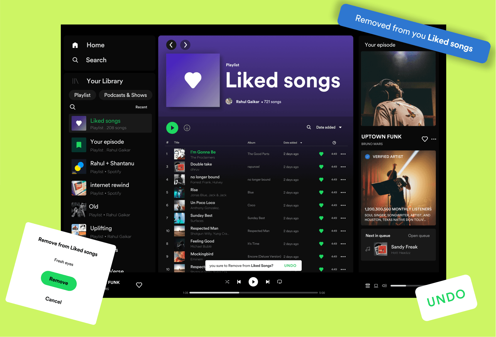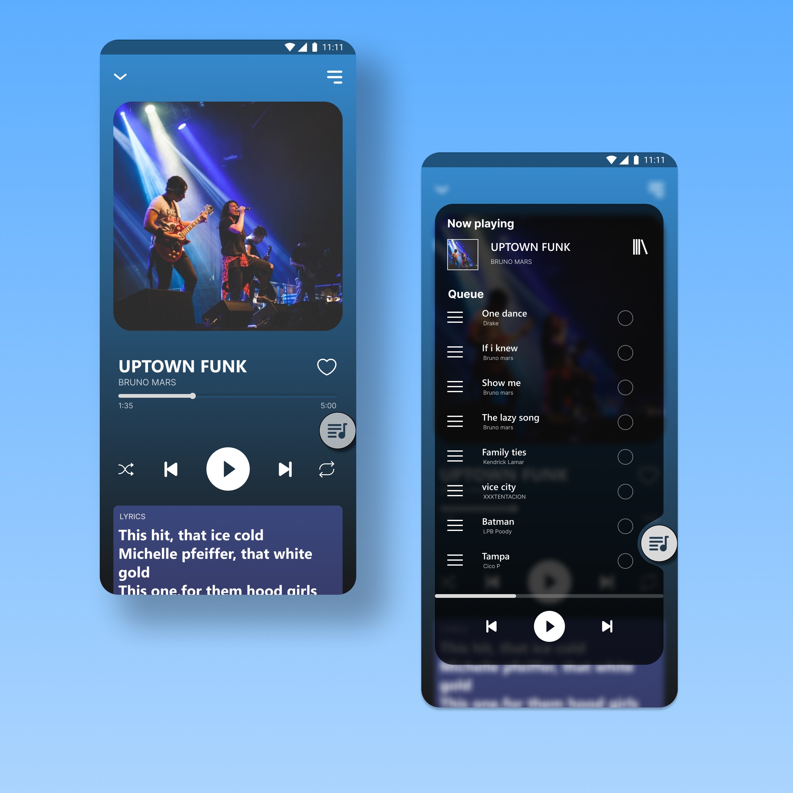
Widgets:

For Windows

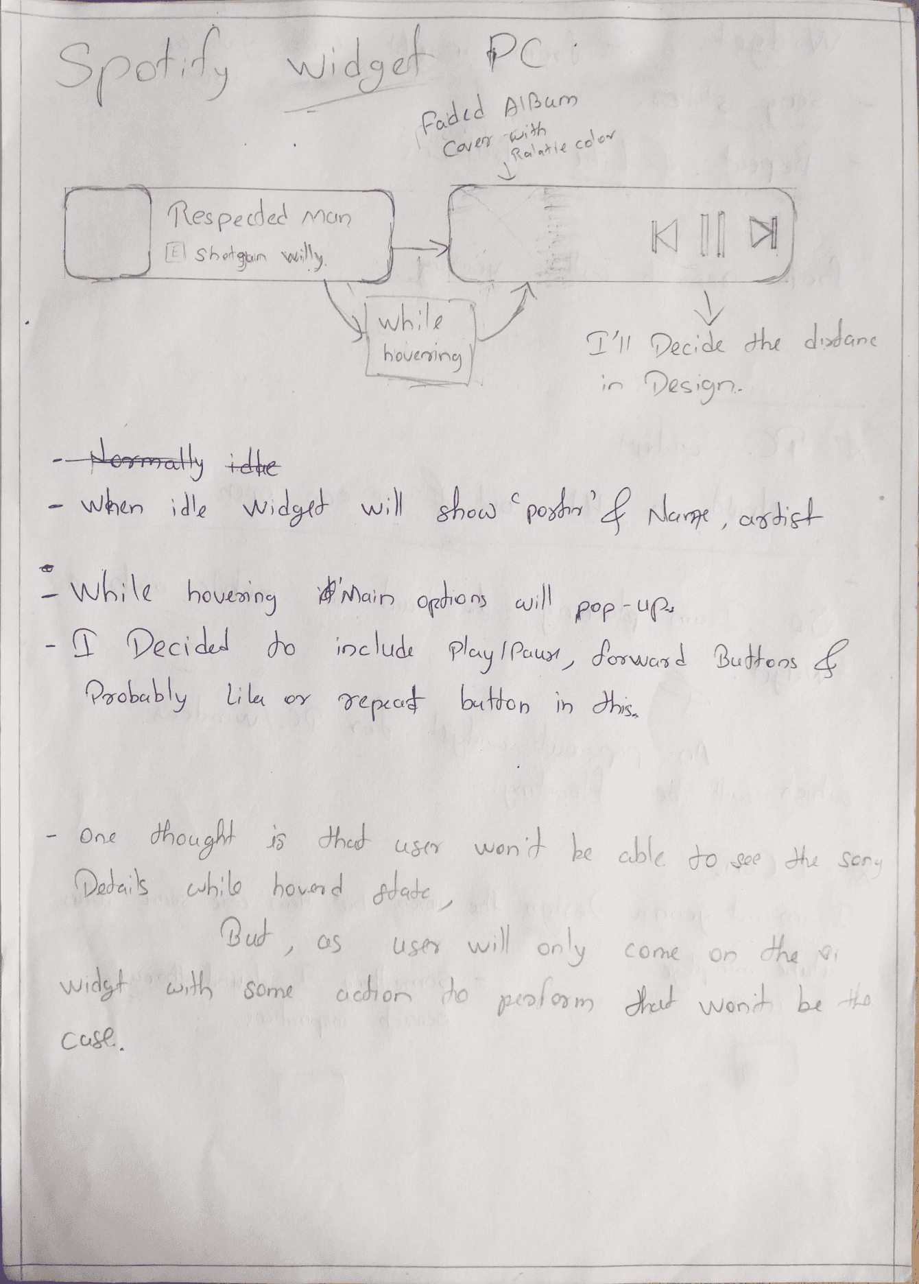
While hovering

While hovering

While hovering

Widgets:

For Windows

Confession

Ideating new features or solving any issue for a product like Spotify which has a huge user base with unlimited diversities is a game of research and stats I believe I didn't have access to.

And I understand that a lot of stuff could shape the decision & development for these features.

And also I didn't have access to the Encore design system of Spotify.

I only created these projects to show my passion for being a product designer at Spotify and my UX knowledge.

There also can be engineering limitations while developing an always-on-top widget, but here’s my take.

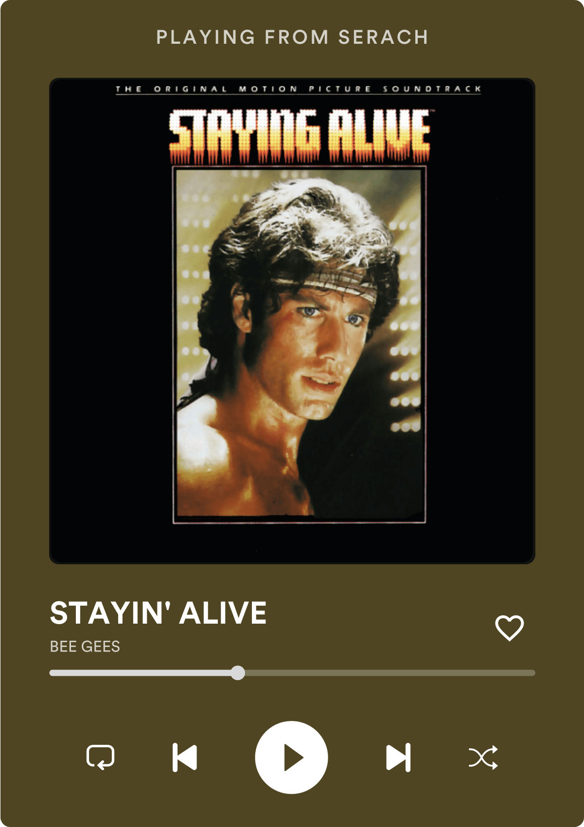
An ‘always-on-top’ widget for Spotify Windows player.

Honestly, I ideated this feature before but later got to know that the web version of Spotify already provides a solution for that, but it could use a lot of work to make it even better.

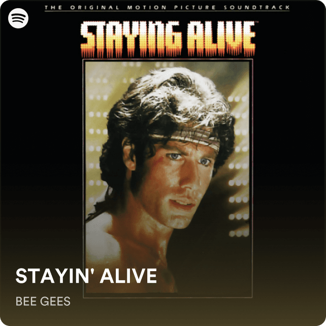
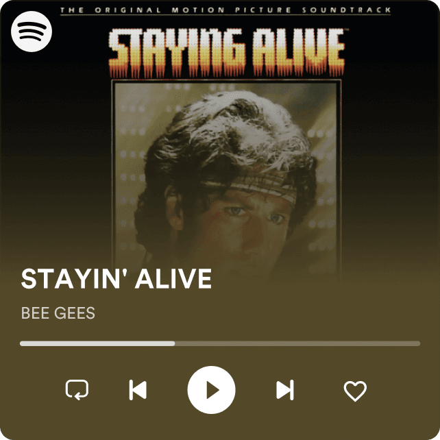
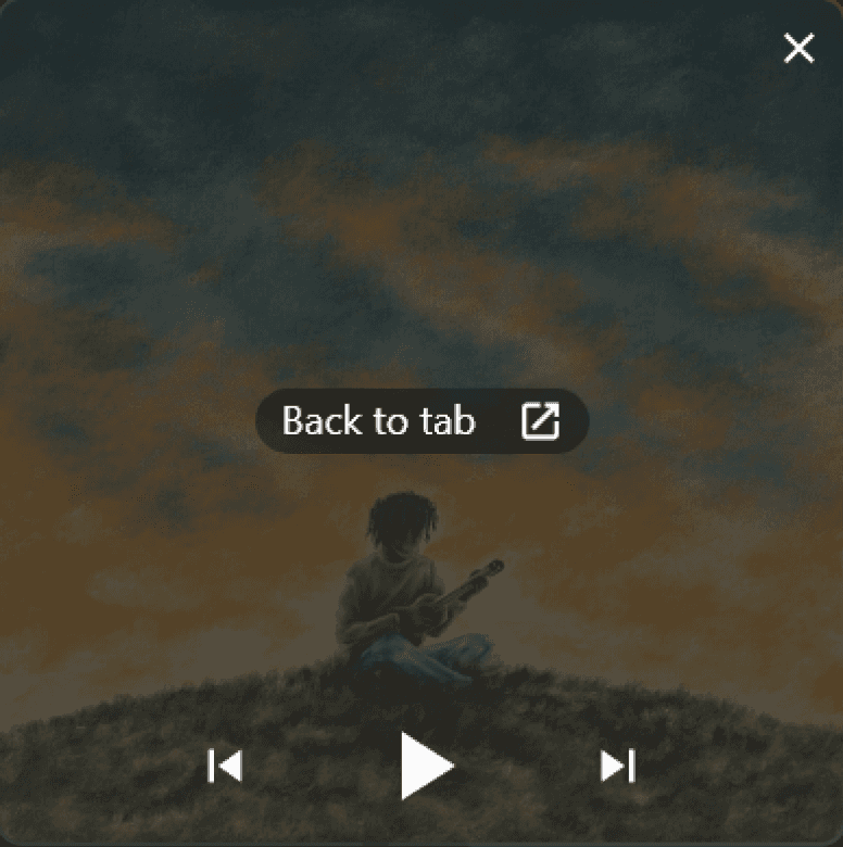
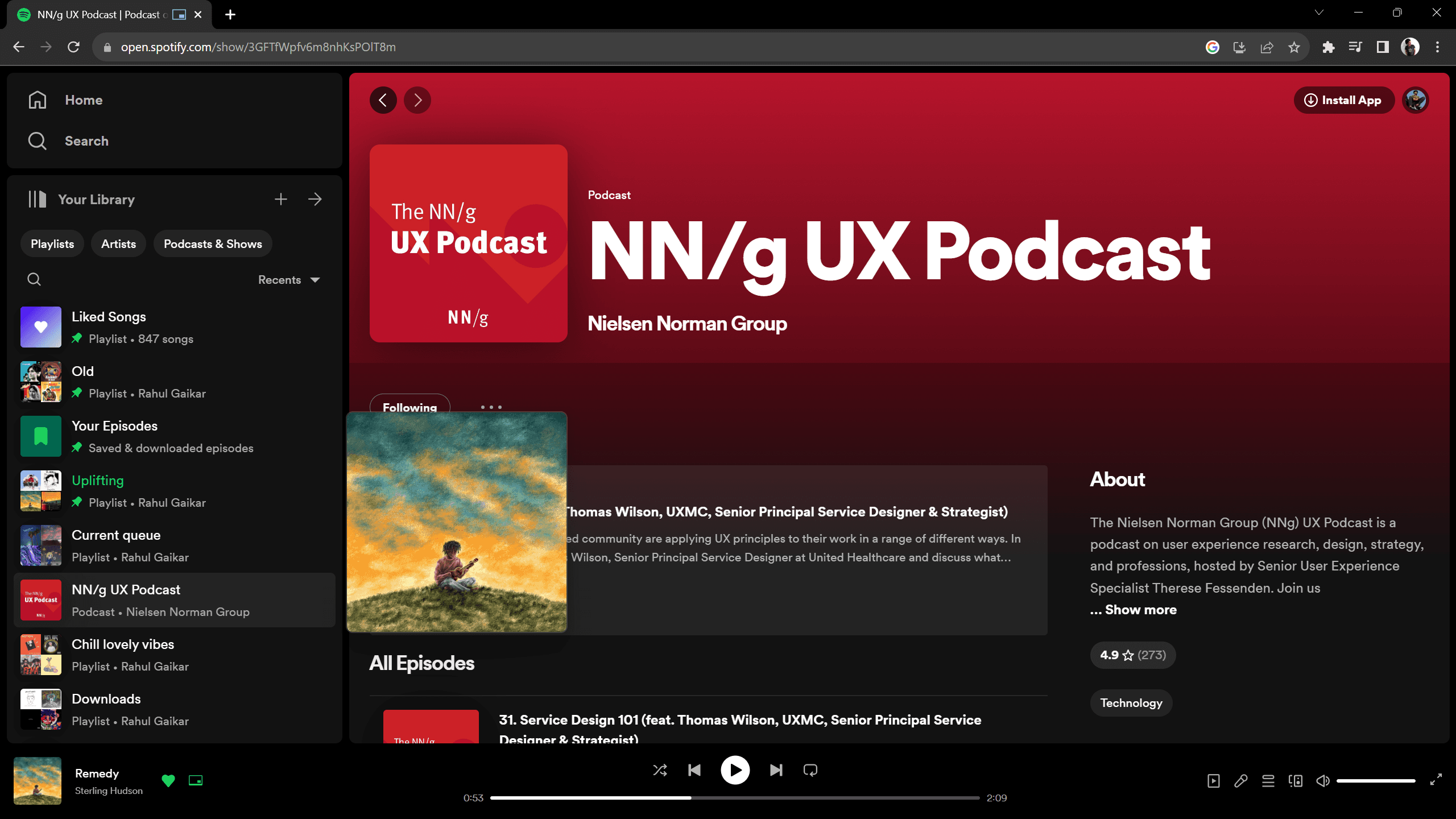
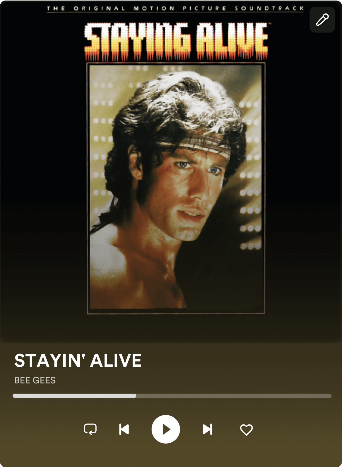
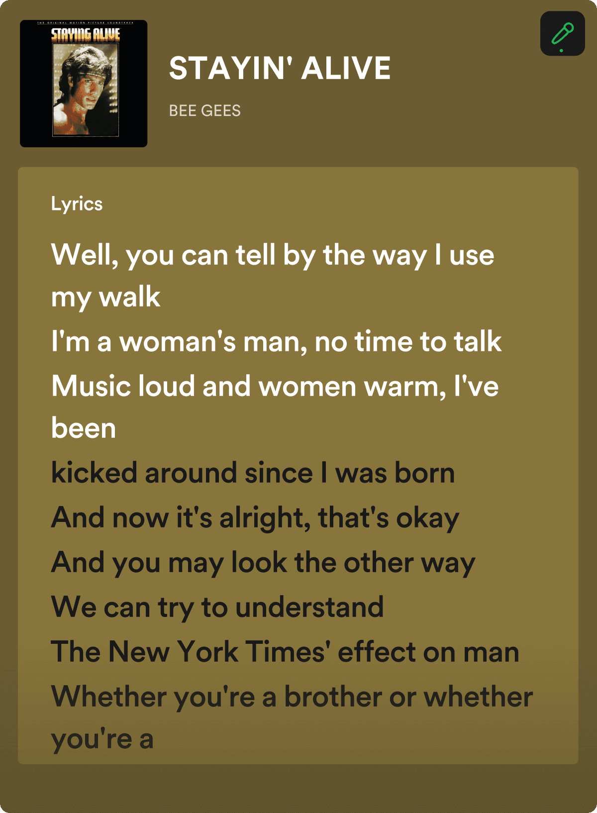
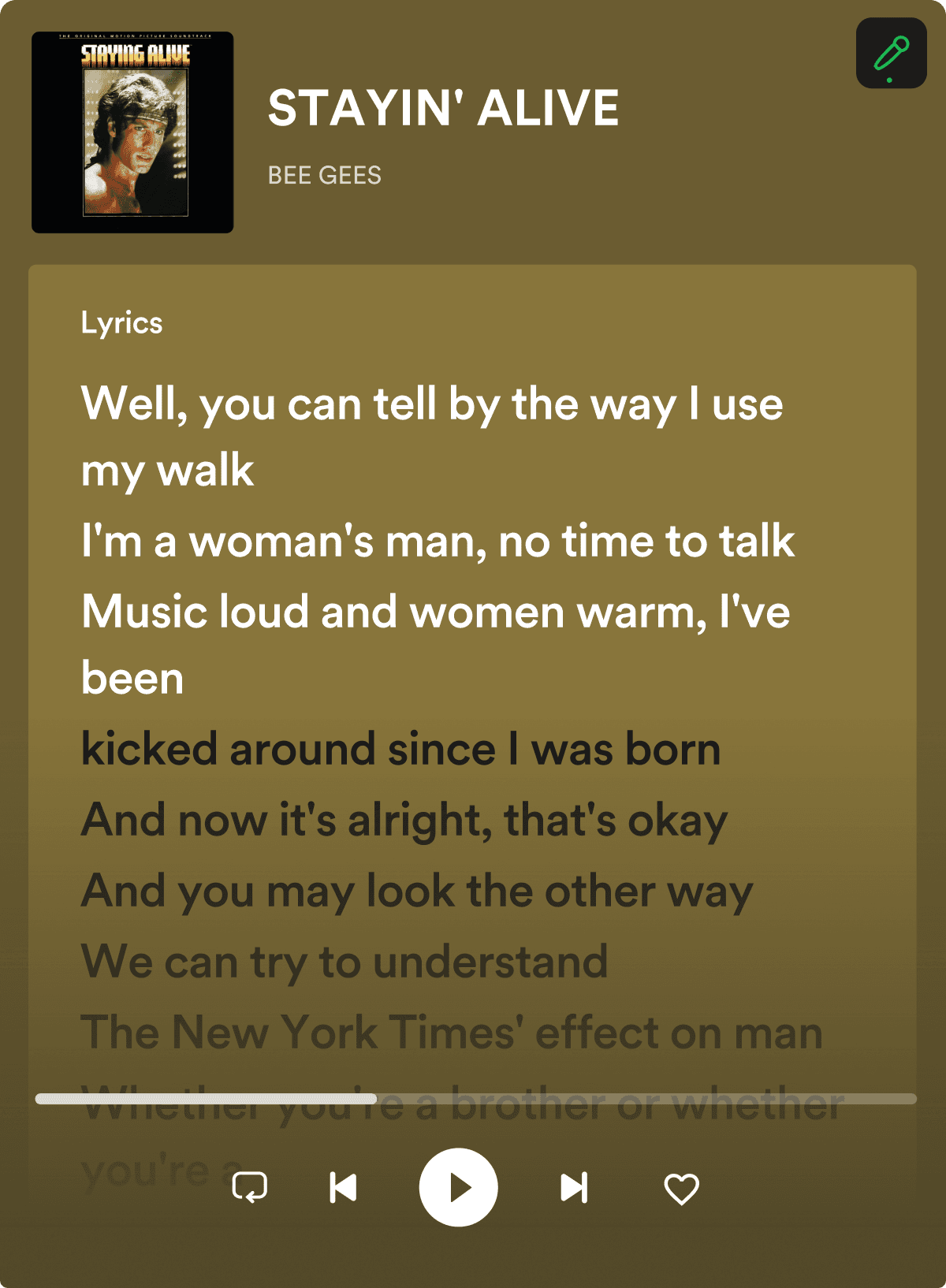
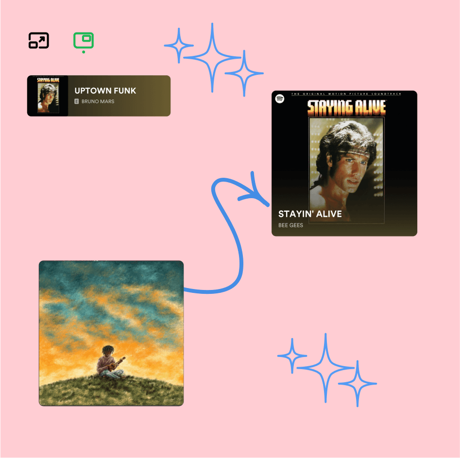
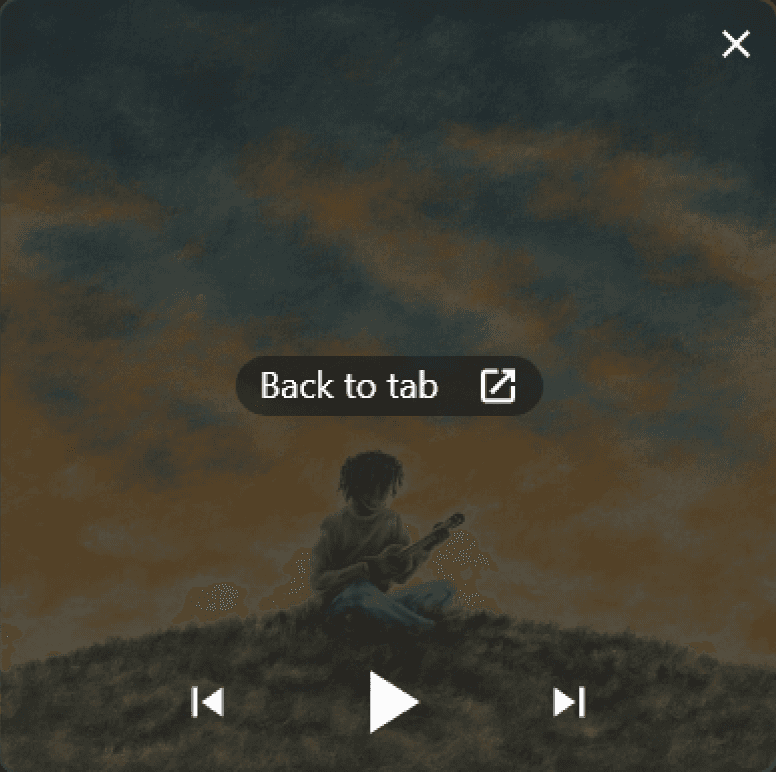
Spotify provides an always-on-top widget from the web version, In which when clicked on the icon gets a new chrome window apparently which holds the album cover of the playing track.

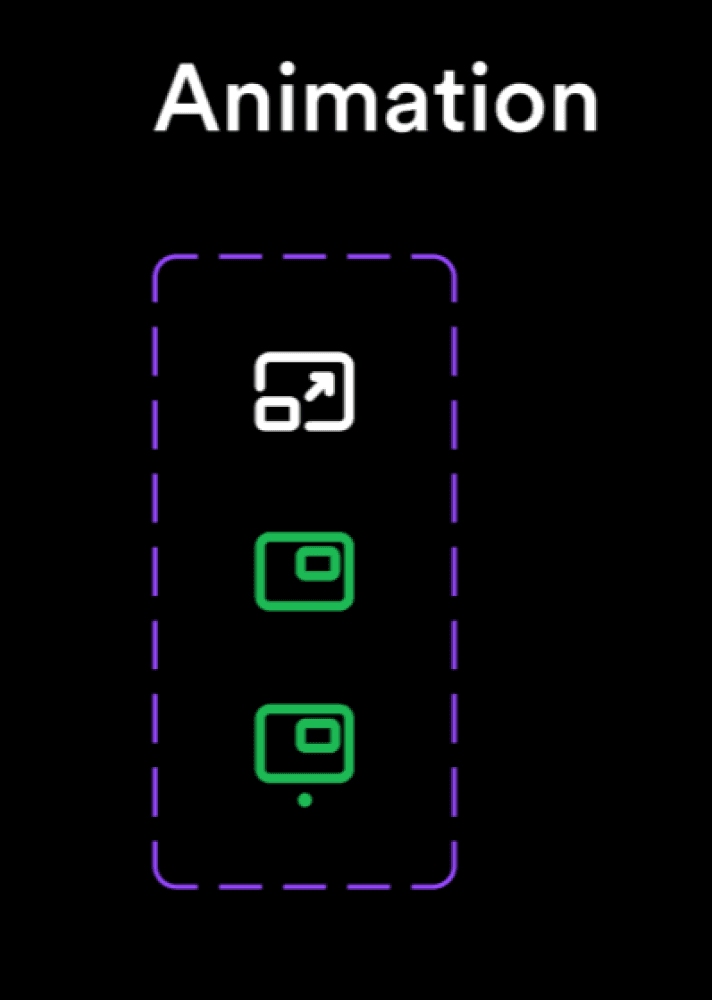
Here’s the icon used to perform the action, placed aside ‘Like button’ near current playing track:

With the widget user gets basic controls of Play/Pause and forward/Backward.

And clicking on the widget will direct user to web player and will close the widget.

With the widget user gets basic controls of Play/Pause and forward/Backward.

And clicking on the widget will direct user to web player and will close the widget.

Ideation

Ideation

While hovering

Obviously without access to proper research, fixing a feature isn’t right. So I decided to conduct small research for it by reaching out to people online or some friends or friends of friends who use Spotify on a daily basis.

Obviously without access to proper research, fixing a feature isn’t right. So I decided to conduct small research for it by reaching out to people online or some friends or friends of friends who use Spotify on a daily basis.

I Tried to cover potential users who will use this feature

Designer

  • Graphic designer

  • video editors

  • visual artists

  • 3D

  • animators

Tech

  • programmers

  • Data entry

  • Tester

Gamers (if we offer a hideout for the widget Its highly possible that gamer will use this feature)

Tech

  • programmers

  • Data entry

  • Tester

I Tried to cover potential users who will use this feature

I Tried to cover potential users who will use this feature

Potential user base

There are so many potential users playing songs in the background while doing their work or any activity.

There are so many potential users playing songs in the background while doing their work or any activity.

Although for users the action of changing the song is just ‘alt+tab’ away.

an ‘Always on top’ widget can be beneficial.

Although for users the action of changing the song is just ‘alt+tab’ away.

an ‘Always on top’ widget can be beneficial.

Research

Research

Potential user base

Icon Design

Icon Design

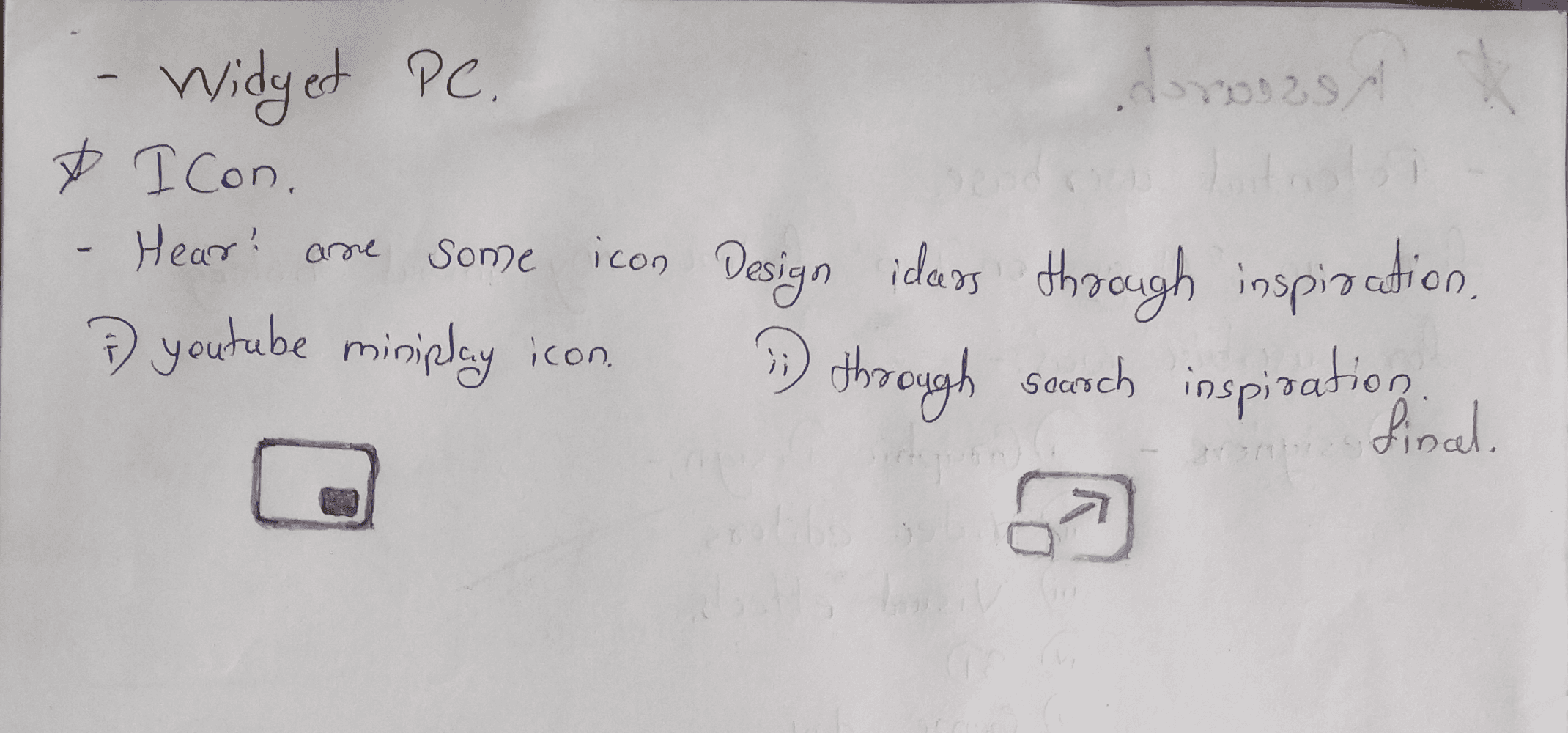
I was searching for the perfect Icon for this on the internet. and finalized on the 2nd one.

I was searching for the perfect Icon for this on the internet. and finalized on the 2nd one.

So after little visualisation, I created a anitmation for the Icon, which will showcase the real purpose of the Icon as the action is performed

Here’s the animation

I have skills to to create the anitmation is After effects also, but for this one I created it from Figma’s Smart animate.

I have skills to to create the anitmation is After effects also, but for this one I created it from Figma’s Smart animate.

So after little visualisation, I created a anitmation for the Icon, which will showcase the real purpose of the Icon as the action is performed

So after little visualisation, I created a anitmation for the Icon, which will showcase the real purpose of the Icon as the action is performed

  • only accessible through Spotify web clipper.

  • Less controls

  • Less customization.

  • Album cover does not updates.

  • Distracting in workflow cause of big screen.

  • only accessible through Spotify web clipper.

  • Less controls

  • Less customization.

  • Album cover does not updates.

  • Distracting in workflow cause of big screen.

Current widget

Process

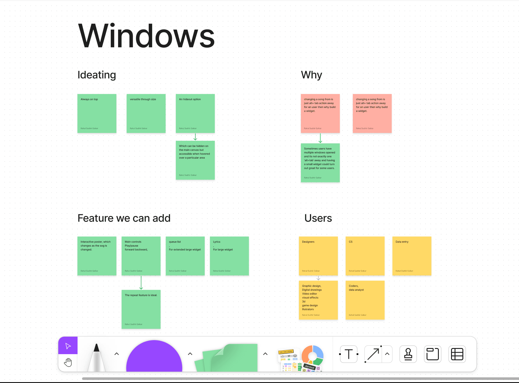
For this specific project I decided to hop into @Figjam to stick some digital notes into whiteboard for outline of the project. and created two sections - Windows and Mobile.

Below is the windows section of the whiteboard.

For this specific project I decided to hop into @Figjam to stick some digital notes into whiteboard for outline of the project. and created two sections - Windows and Mobile.

Below is the windows section of the whiteboard.

I wanted to create an interactive widget through size.

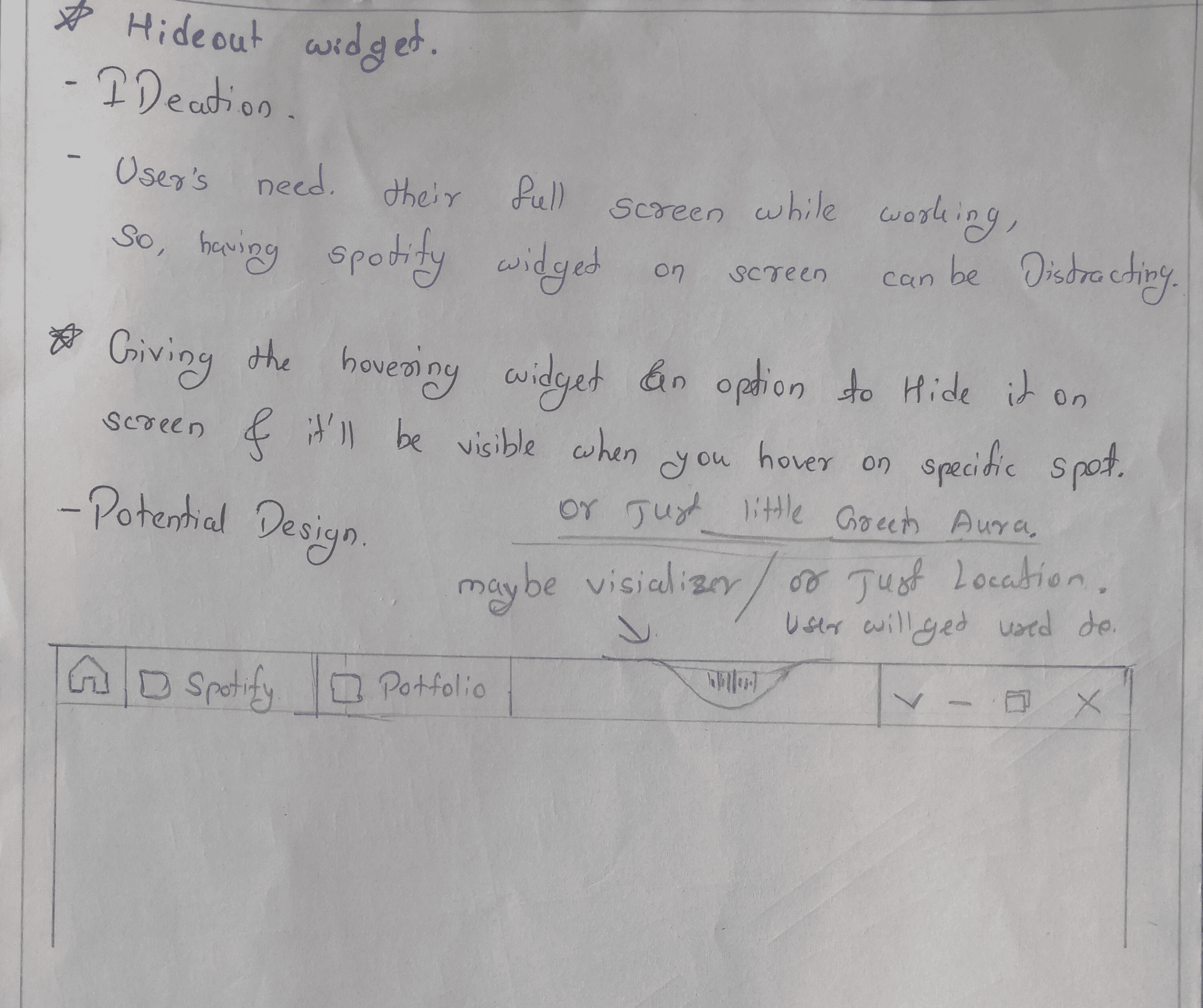
Also, I had the vision to make it a hideout, so the user can stick it to one side of the screen, maybe there will be a visual cue to let the user know that he/she has hidden the control at a specific part of the screen.

And he can just hover over the specific part to get access to the controls.

Something which is kinda obvious is that a bigger size will interactively come with more options.

So, if the user wants more controls he can increase the size.

Something which is kinda obvious is that a bigger size will interactively come with more options.

So, if the user wants more controls he can increase the size.

Designing

Small

While hovering

I added both options to the first design because there was space.

But design in software and users having a feature in their different size devices are two different things.

Deciding on the proper clickable area for a button is important.

So, here’s another design with bigger icons.

I added both options to the first design because there was space.

But design in software and users having a feature in their different size devices are two different things.

Deciding on the proper clickable area for a button is important.

So, here’s another design with bigger icons.

I started with a small widget size as it will probably be the most used widget.

Primarily I decided that the ‘repeat’ option could be something we should keep in the design alongside the main 3 options Cause:

As for me being social and a generalized thing people put a track on repeat while working sometimes

And also, According to my interview with one participant. He strongly stated that there should be a repeat button for this feature.

This was from the ‘add to queue’ case study research interview I took on Discord.

And for the second iteration:

I gave a peek at the queue list by adding one button in the top right corner.

There won’t be a need for the 3 lines in the front of the track as the user can just ‘hold’ and ‘drag’ any track to the desired place. and this action is universal in computer users.
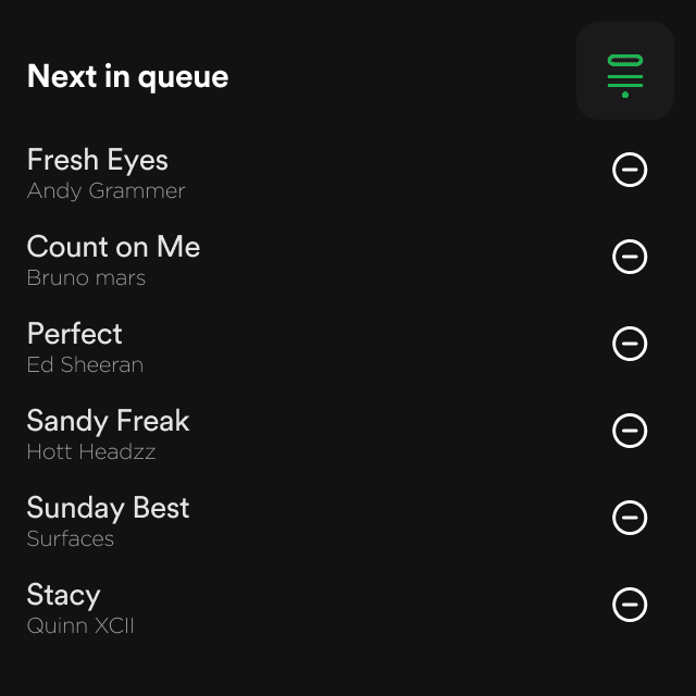
I sent this prototype to one guy I researched to test, and the results were positive so decided to keep this option in a medium widget.

I sent this prototype to one guy I researched to test, and the results were positive so decided to keep this option in a medium widget.

Firstly, I copied the mobile design for the queue list implementation to see how it would work.

Here’s the final prototype for medium-sized widget:

Here’s the final prototype for medium-sized widget:

And for the second iteration:

I gave a peek at the queue list by adding one button in the top right corner.

And for the second iteration:

I gave a peek at the queue list by adding one button in the top right corner.

Simple medium-sized widget, having name and artist showing and when hovered over user gets the all the essential controls.

For medium size widgets, I had more space to work with, but at first, I only created a simpler version.

For medium size widgets, I had more space to work with, but at first, I only created a simpler version.

Medium

Although the gradient as a background looks Good.

The widget's main function is to be accessible while the user is performing productive activities or any other activity.

So even though for the mobile widget, it is a must to have aesthetics.

But, the Widget for PC should be minimalistic and to the point.

For the Large size widget, I was trying to go through the potential user mind where the user will use this big size to imagine the potential scenario, and according to current knowledge about Users and research there are actually really fewer scenarios, so I did not give much to designing large widget, but here are some iterations.

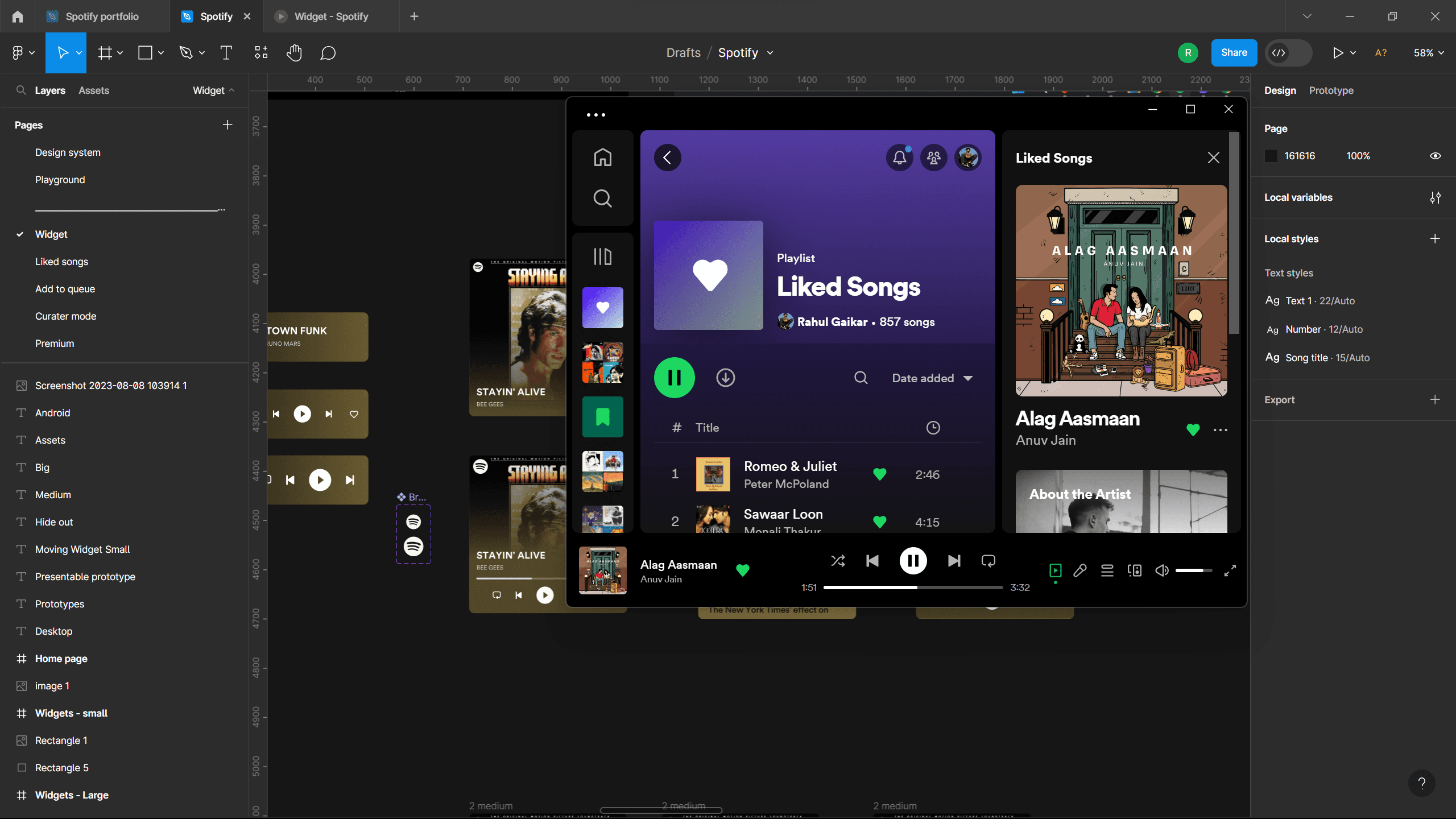
The current Spotify Windows app can be downsized this much as on my computer. but what I am trying to create here should be mobile and always on display.

So I created one more design iteration.

  • easy for eyes yet good looking.

  • All the essential options.

So I created one more design iteration.

  • easy for eyes yet good looking.

  • All the essential options.

Here is the first design I created for the big widget.

Didn’t look good.

Firstly I implemented the lyrics option to the widget

But quickly realized that it is not usable as a user must be working so if the user wants to check the lyrics he can just head back to the application or Web clipper.

But quickly realized that it is not usable as a user must be working so if the user wants to check the lyrics he can just head back to the application or Web clipper.

Prototypes

Prototypes

Large

Although the gradient as a background looks Good.

The widget's main function is to be accessible while the user is performing productive activities or any other activity.

So even though for the mobile widget, it is a must to have aesthetics.

But, the Widget for PC should be minimalistic and to the point.

Scenario: A video editor doing work on Premiere Pro and has song plating in

background.

Scenario: A video editor doing work on Premiere Pro and has song plating in

background.

Little prototype showcase of how users will interact with widgets.

Little prototype showcase of how users will interact with widgets.

Prototype

Here’s some ideations on widget hideout for Gamers

Here’s some ideations on widget hideout for Gamers

A hideout widget brings up so many things about usability and how a gamer Benefits with this feature. but Giving it a little thinking and going back to the days I used to play games personally and also going over my friend's needs while gaming, I feel this feature has potential if we improve on it with proper research and ideation.

Anyway, here’s a try on how the solution could look like.

I have only iterated on this idea through Figma.

There weren't any phases to this ideation so it's far from perfect for real-world implementation.

Still here are some ideas on how can we propose a widget hideout.

This displays iteration when the widget is hidden.

  1. Spotify logo, with the same colour background as of track background.

  2. Just a little colour Aura, a visual cue for the user where the widget is hidden.(could be track BG or just Spotify brand identity colour.

  3. Visualizer.

One problem with the hidden widget is users won't be able to see the title of the song, as this widget is built in such a way that when the user hovers over the widget all the essential controls will slide in from right pushing the title to left.

This way user won't be able to see the title of the track.

Here's the prototype I built for the solution to this problem.

  • When user hovers over the cover image he gets to see the title of the track.

  • When hovered over the rest of the widget users get all the essential controls.

I see potential in the hideout feature cause if done right, I see people who play a song while doing productive activities using this feature.

I plan to complete the usability study for this project after I complete my portfolio design for Spotify and apply.

I plan to complete the usability study for this project after I complete my portfolio design for Spotify and apply.

While creating this project I lacked research. 

& conducting a usability study was mandatory to improve the UX of projects like this.

I might conduct a usability study by reaching out to people on the internet as I had a design to showcase but this small research isn't very helpful for a product like Spotify with a huge user base.

Takeaway and problem

Credits
Rahul Gaikar

Aspiring Product Designer

Rahul is a Generalist Product designer and is currently on a mission to achieve his dream of getting a job in Spotify design team

Rahul Gaikar

Aspiring Product Designer

Rahul is a Generalist Product designer and is currently on a mission to achieve his dream of getting a job in Spotify design team