
I only created these prject to show my capabilites in UX design, and I undersatnd that their are lot of stuff which could shape the descisions devlopment for this feuters.
Ideating new feuture or solving any issue for the product like spotify which has huge user base with unlimited diversitites is a game of research and stats I beleieve I didnt had accses to.
And also I didnt had accsess to design system of Spotify.
Ideating, creating and devloping of any new feuter in a big tech product copany like this is preety complecated process
Credits

Rahul Gaikar
Aspiring Product Designer
Rahul is a Generalist Product designer and is currently on a mission to achieve his dream of getting a job in Spotify design team
Read More
Takeaway
Improving mobile widget of spotify
Ideation
Why
Research
I see a lot of improvement in Current widgets for mobile.
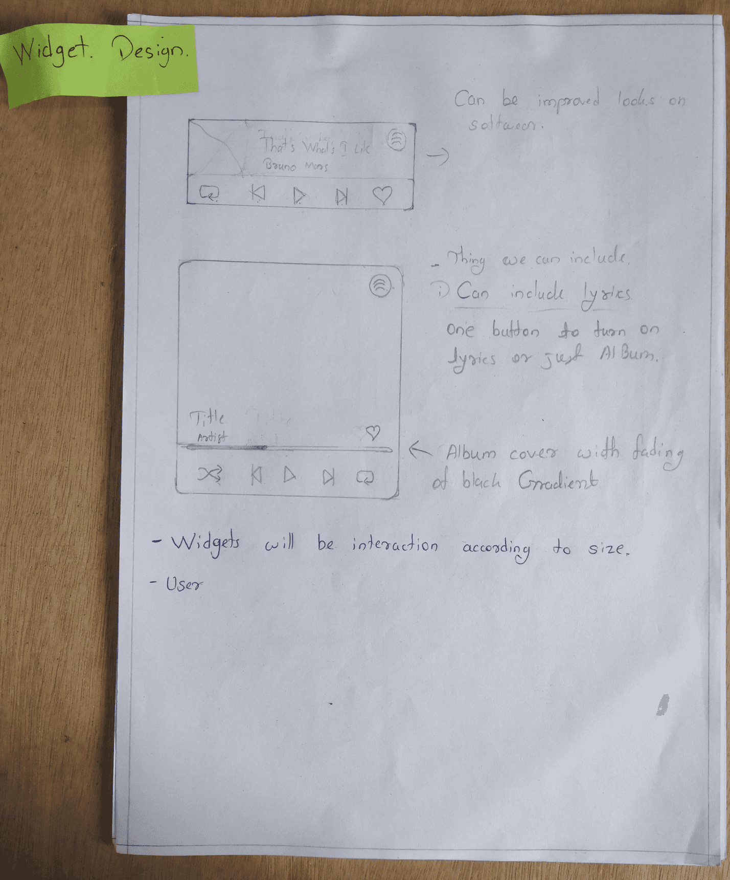
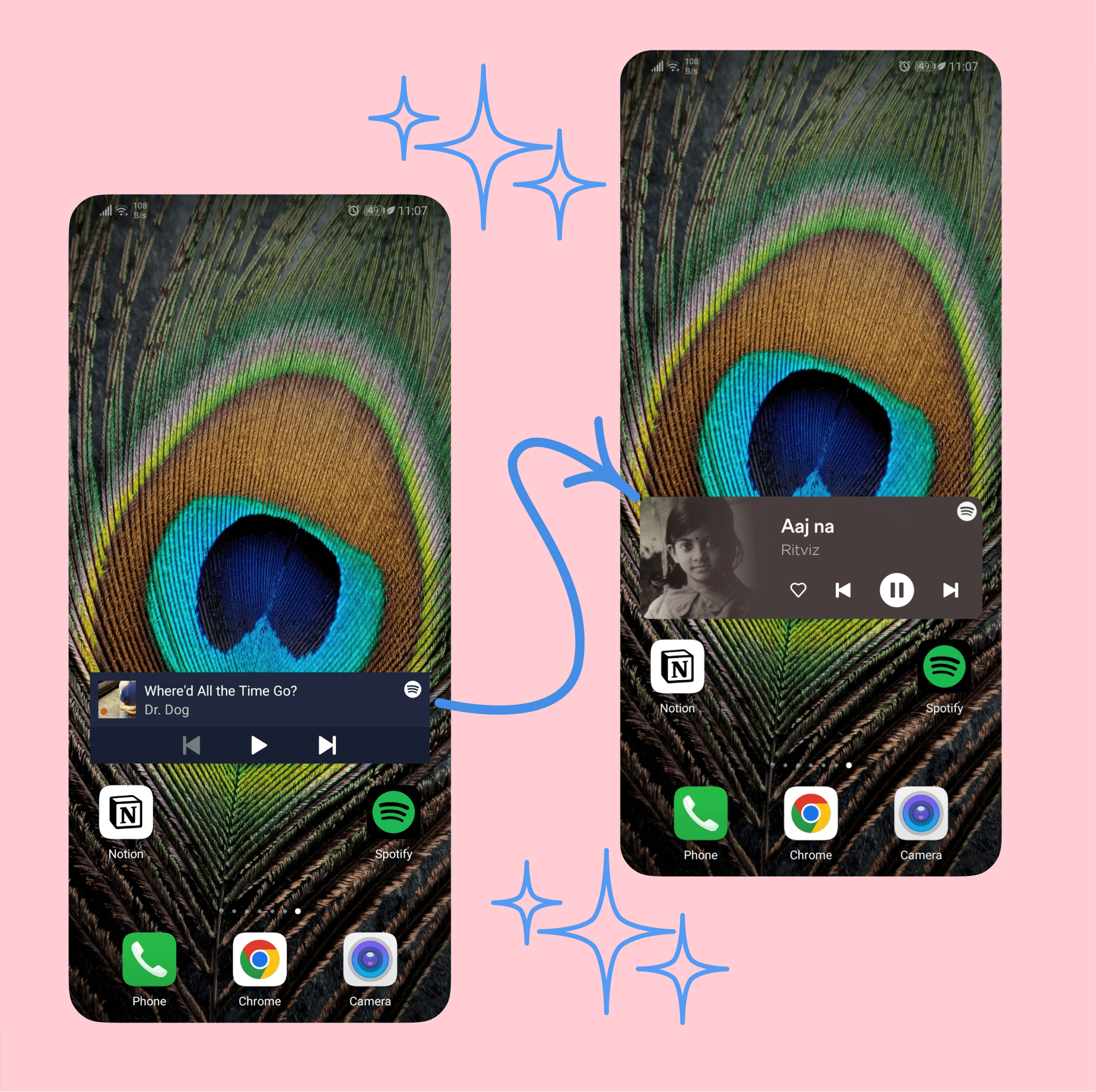
making it interactive according to size. Bigger size, more controls.
Visually appealing. as it serves as just a showpiece for the home screen.
Personally, being a person who organizes his environment I have the same habit for my digital experiences, so to make it appealing and functional.
While doing my video interview for another Spotify small project I came across a really good participant. who is tech savvy, a premium member and also an android widget user.
Through insights on that interview I overcame this why.
why design a Widget for home page when user can access all options from notification panel buy just swiping it down.
Also these projects I am doing are just to showcase my knowledge and skills in product design,
There could be a case where I researched more and found out this project isn't possible cause or something, or it's not a right solution according to this.
And ultimately that's what product design is.
While doing this project the big question stays that is ‘why’
Current widget
My design
Widget project
Design process
Problem
While creating this project I lacked research.
& conducting a usability study was mandatory to improve the UX of projects like this.
I might do conduct a usability study by reaching out to people on internet as I had design to showcase but as this small research aren't much helpful for product like Spotify with huge user base.
I plan to complete the usability study for this project after I complete my portfolio design for Spotify and apply.
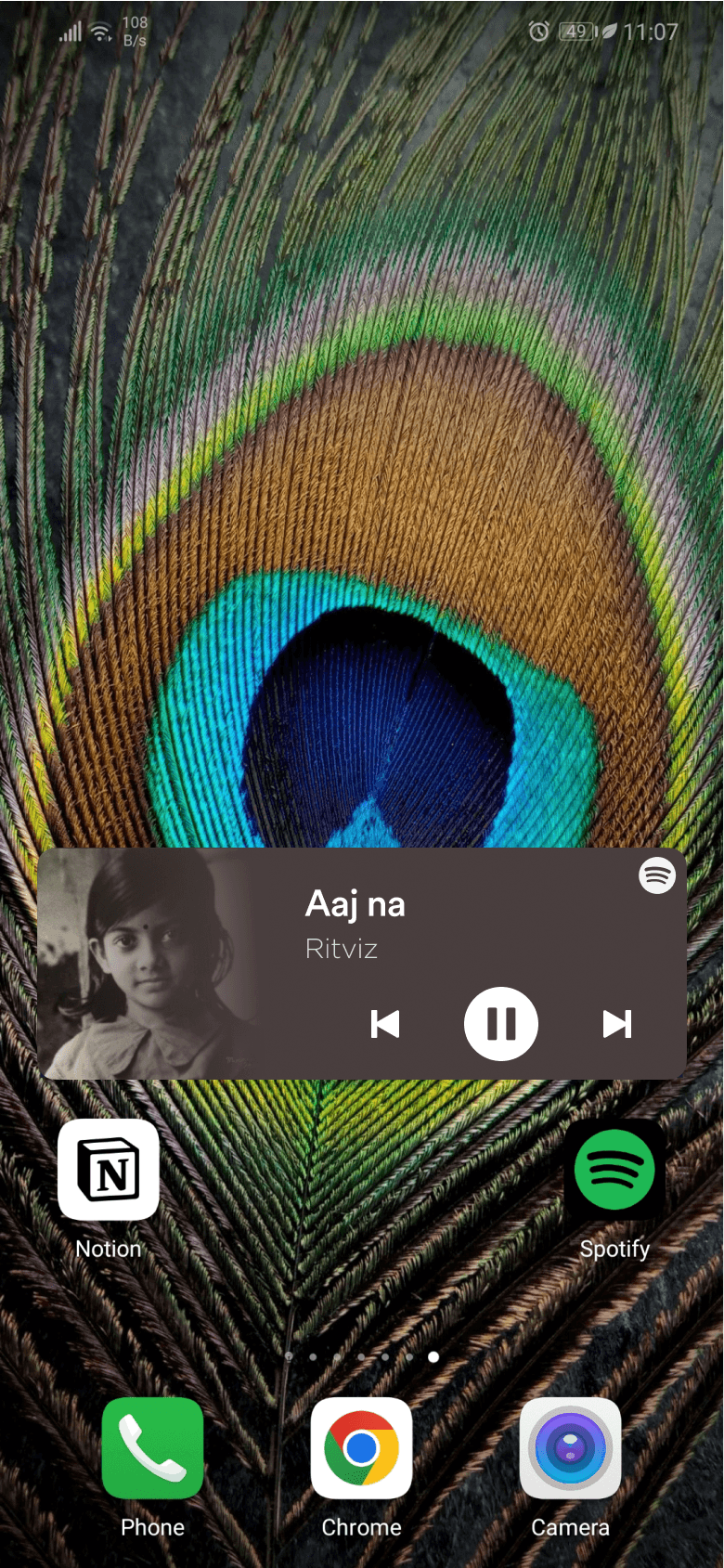
Small
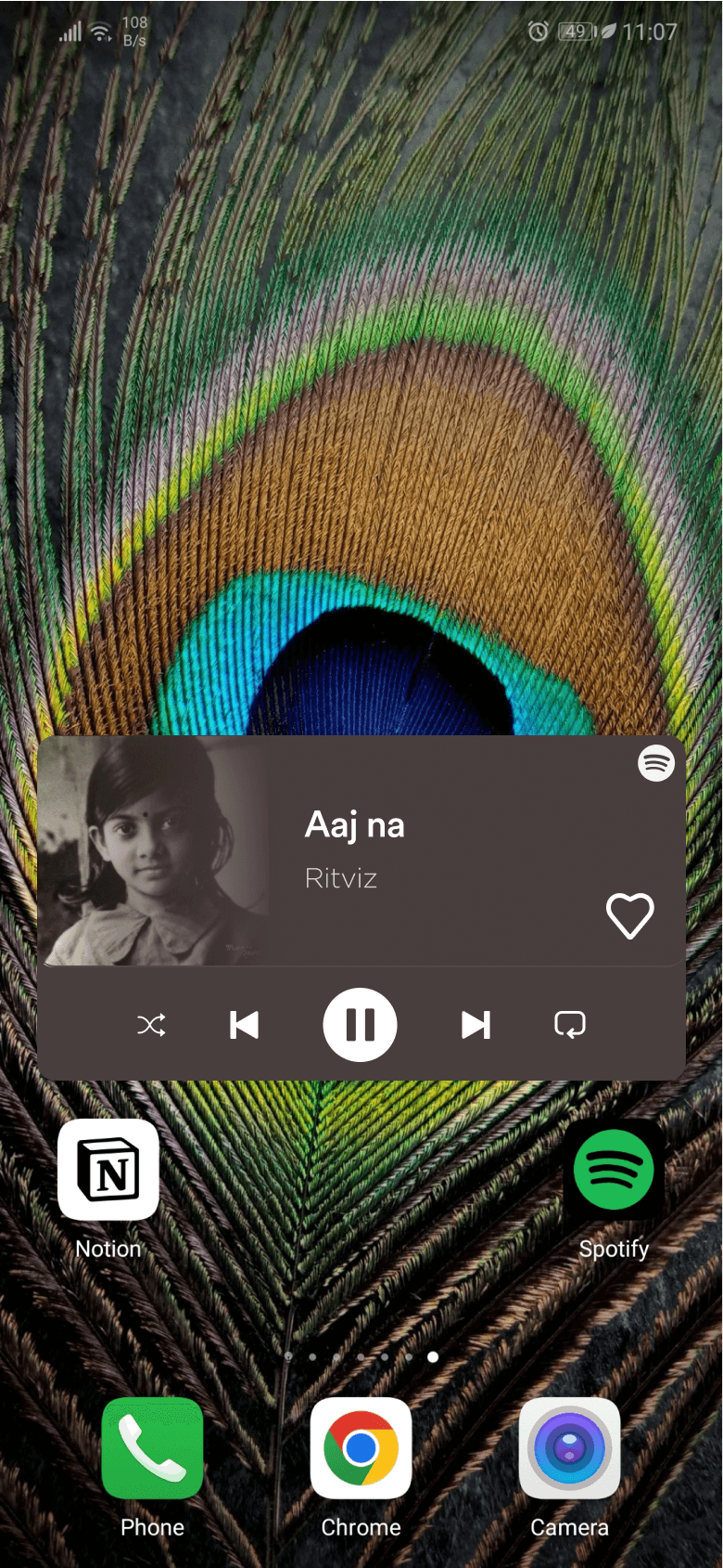
medium
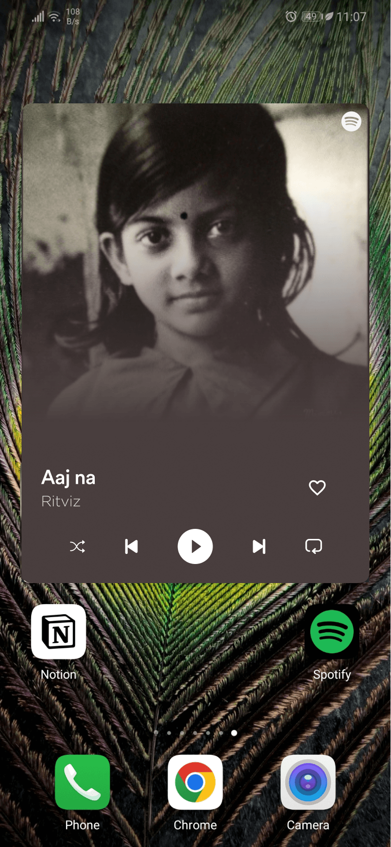
Large
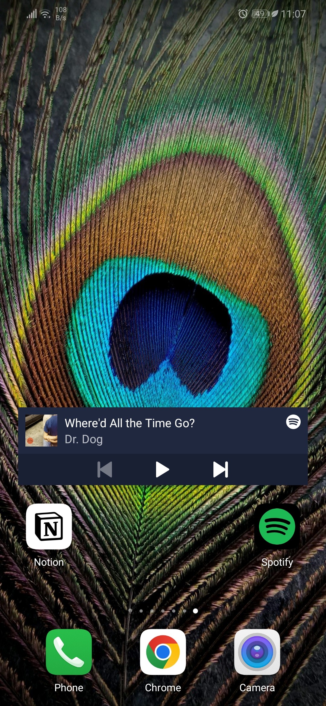
My home screen
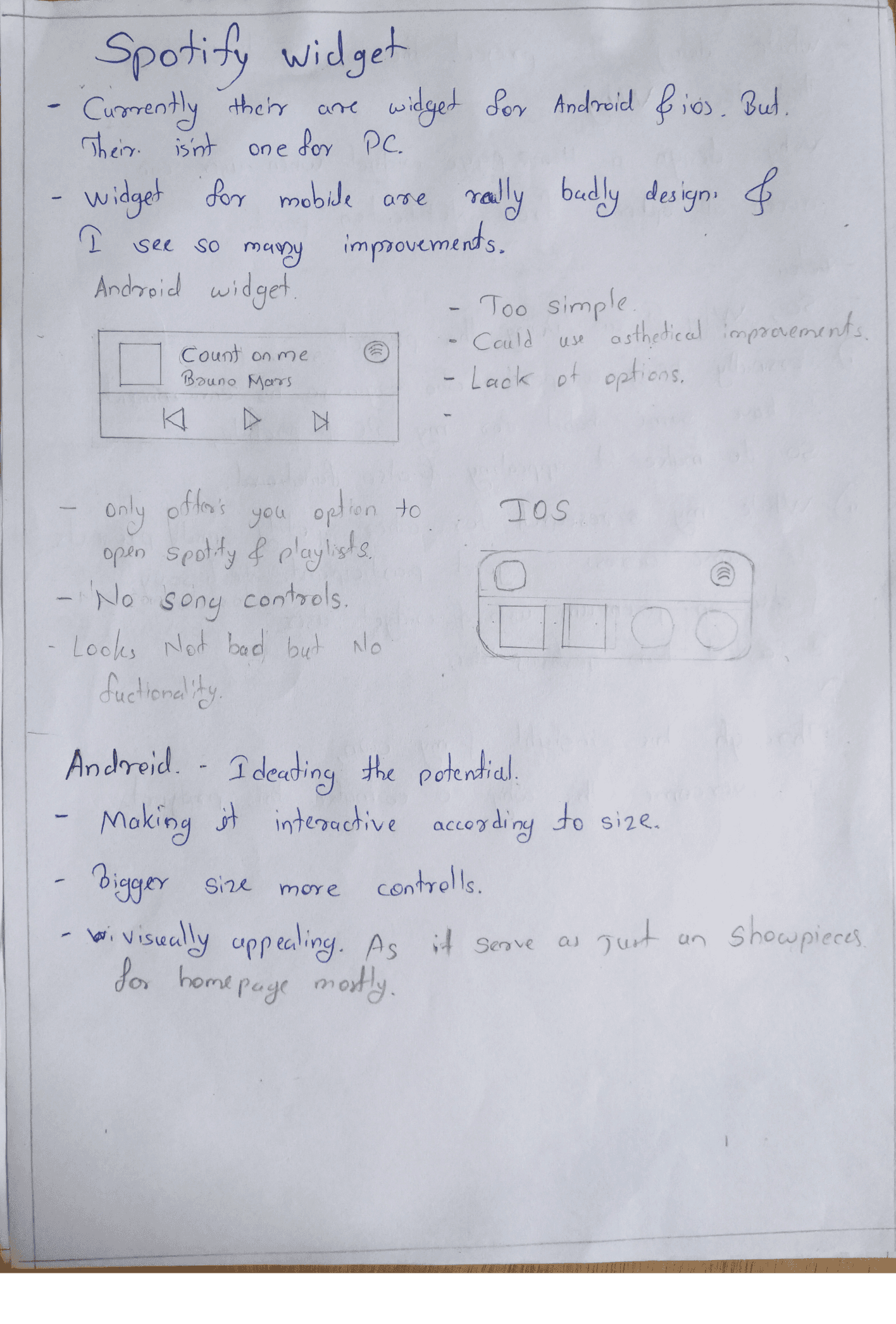
Android
too simple
Could use aesthetic improvements
lack of customization.
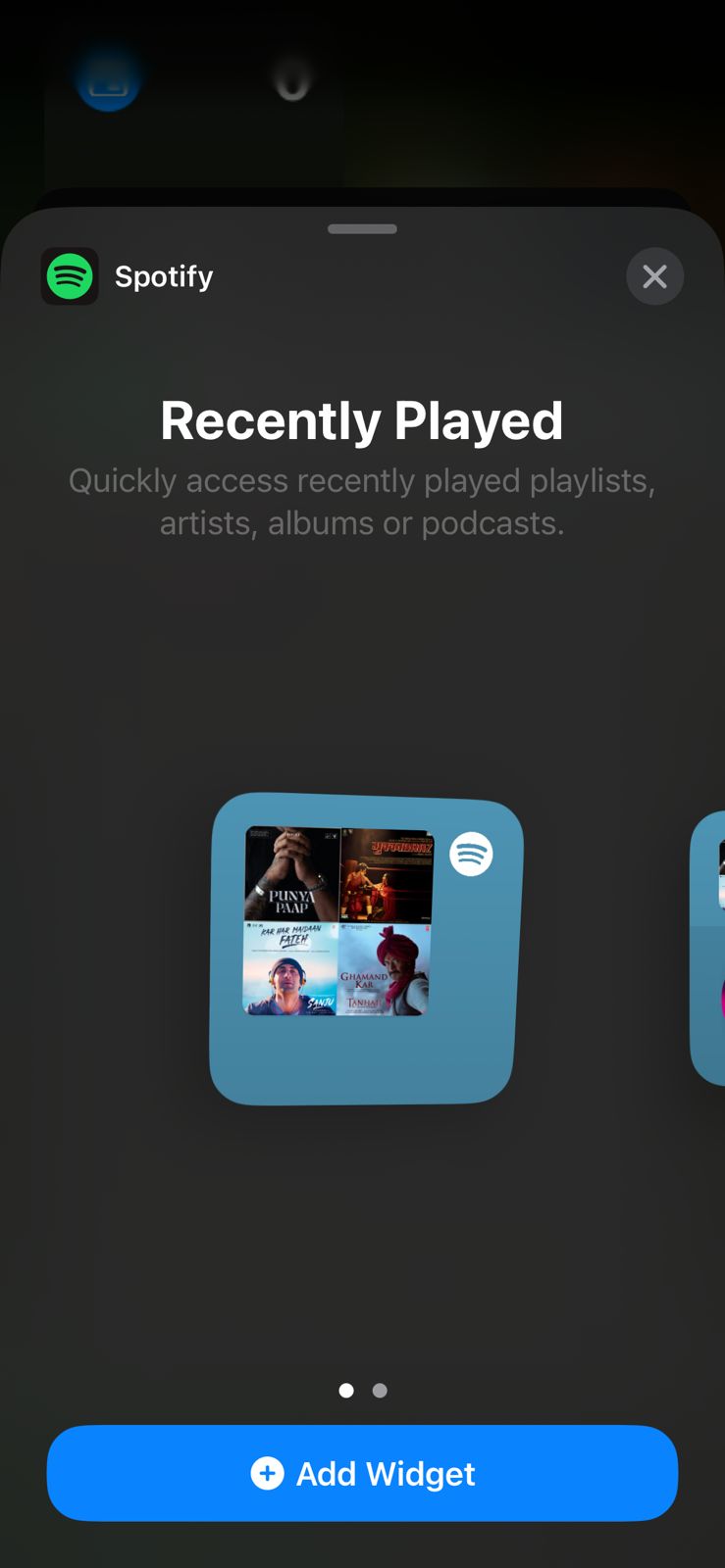
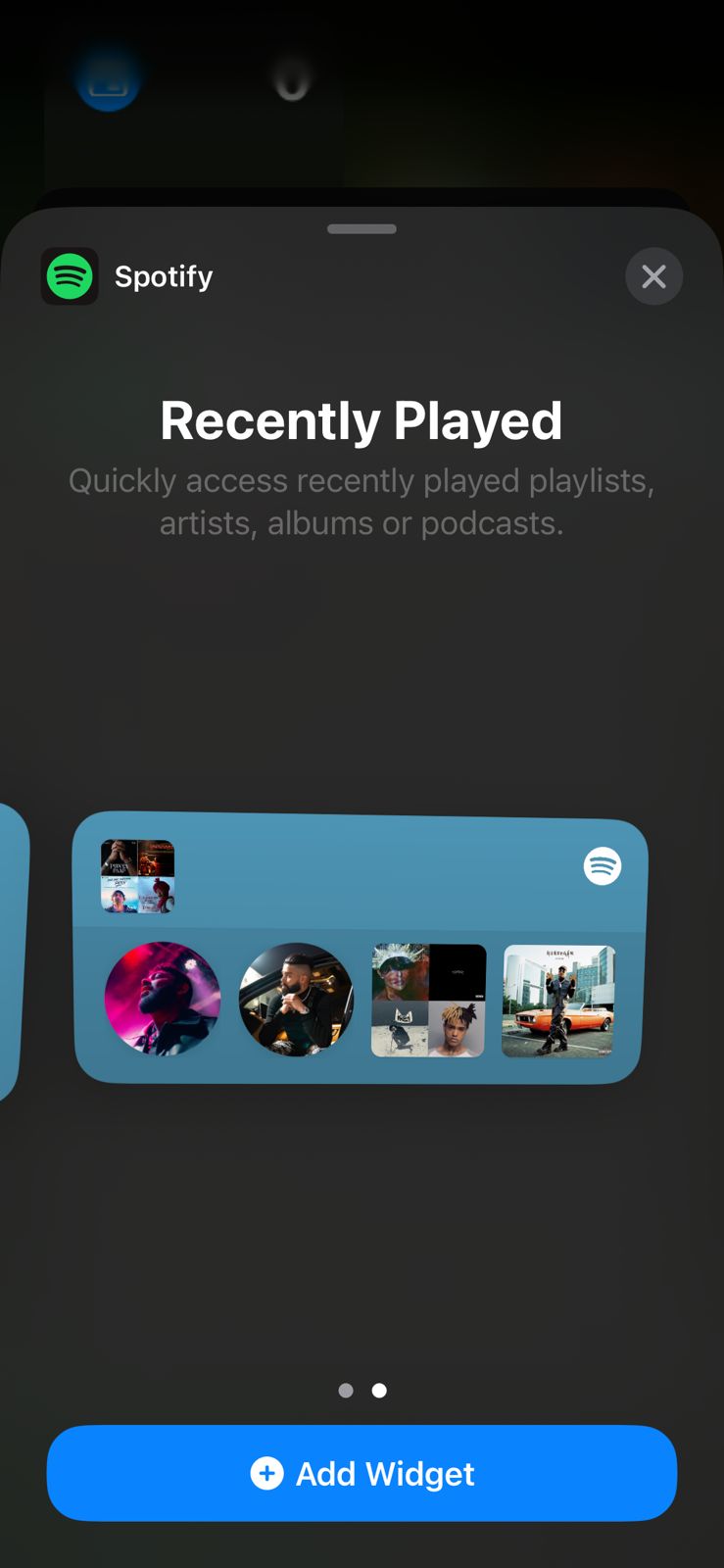
IOS
Only offers user the option to open Spotify or any playlist.
No songs control.
Here are my 3 designs implemented in my home screen.
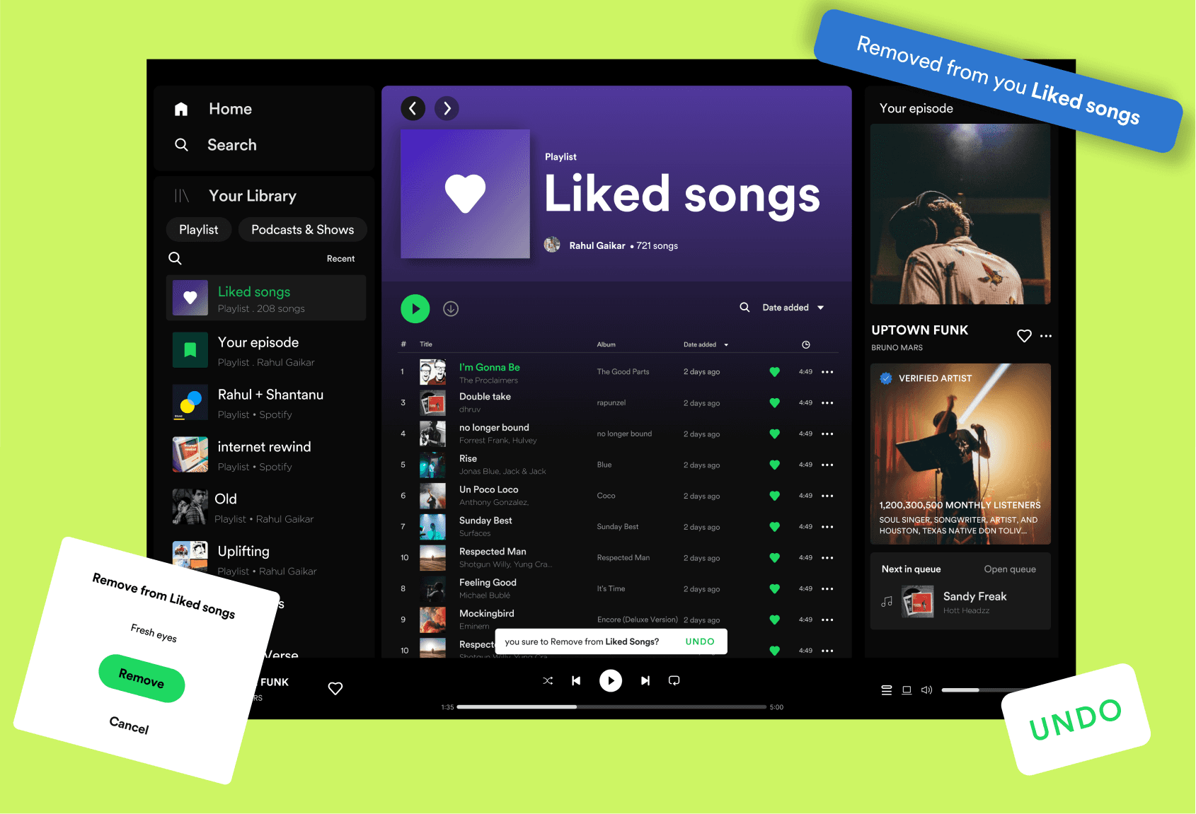
Both the mobile version and windows version of the project are created side by side, but I decided to document them in two different case study showcases.
This process went well with showcasing both the use cases of the feature but made it difficult to show my design process behind creating widget project.
While doing the add to queue project research, I decided to ask some initial questions for my next project that is widget design to my participants.
That call gave me a clear direction of the project. I hopped onto pen paper that day to write out ideas about the widget project before continuing on the ongoing one.
Through my findings I led out some potential feature :
Windows :
Minimalist design to eliminate distraction.
Repeat option will be ideal pick
Interactive according to size change
Repeat option can be a great option.
Mobile:
Aesthetics are a priority as mobile widget can serve the purpose of showcase.
Interactive according to size change
Bigger size more controls
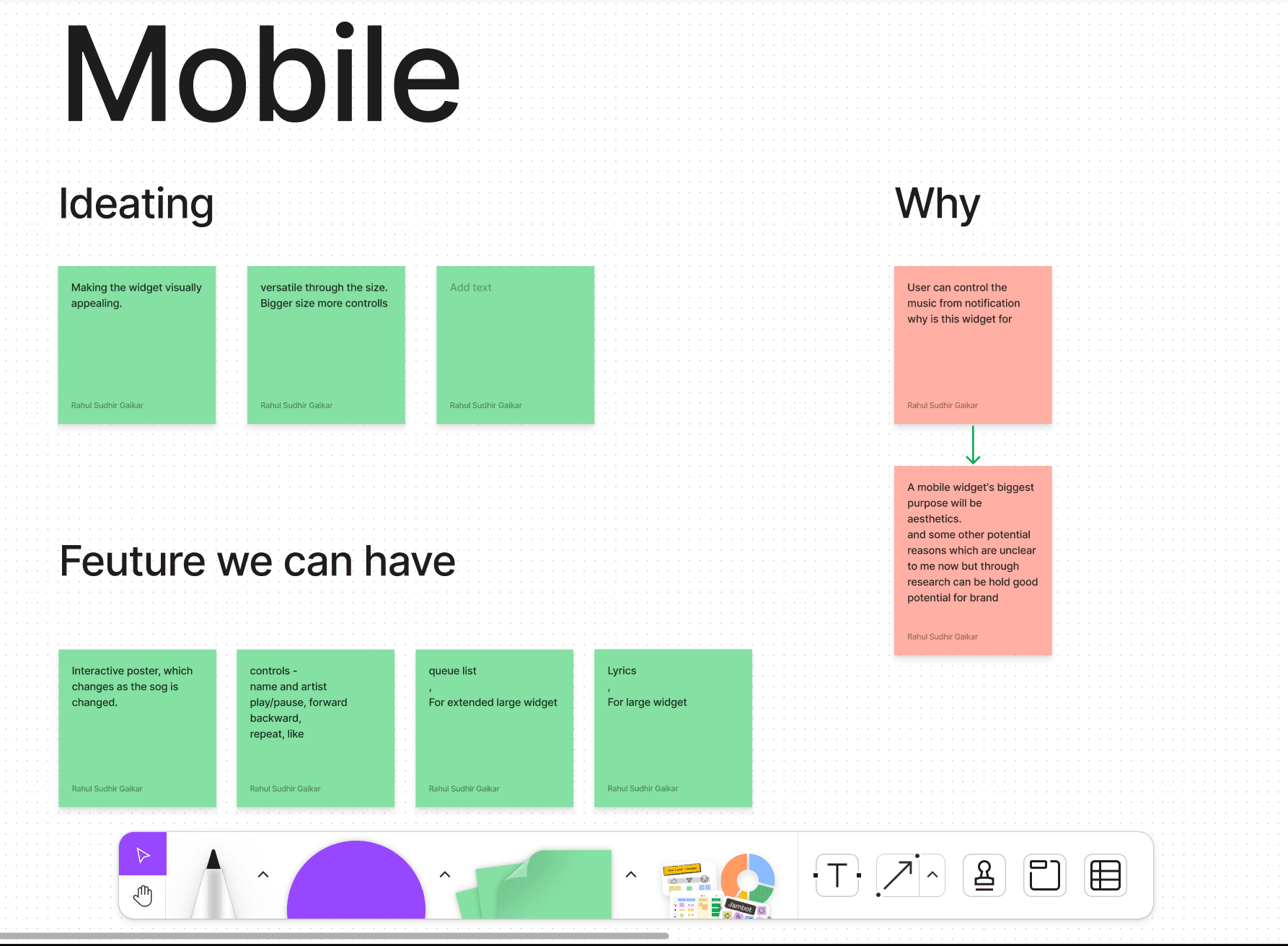
For this specific project I decided to hop into @Figjam to stick some digital notes into whiteboard for outline of project. and created to section - Windows and Mobile.
Below is the Mobile section of the whiteboard.


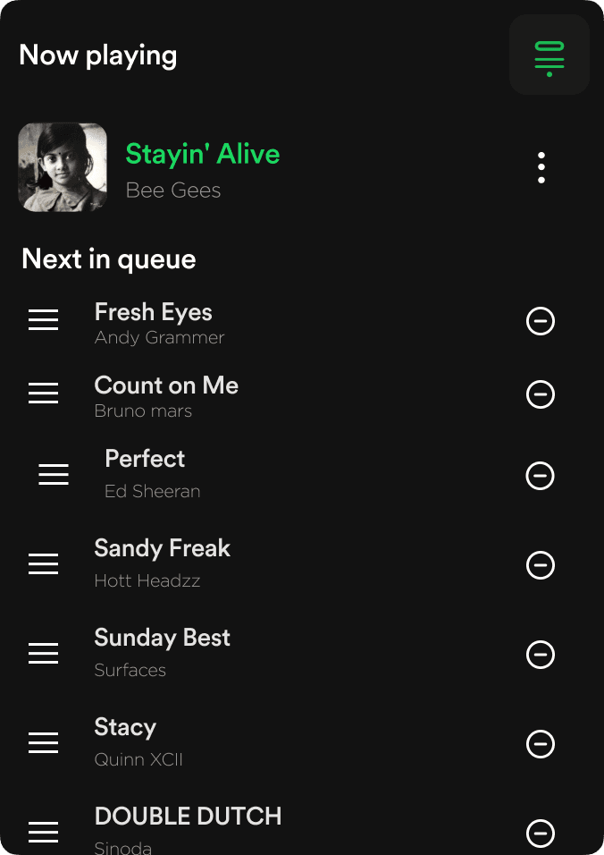
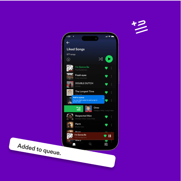
Problem solving project
Add to queue option
Users are unaware of the simple and interactive way of adding a song to the queue.
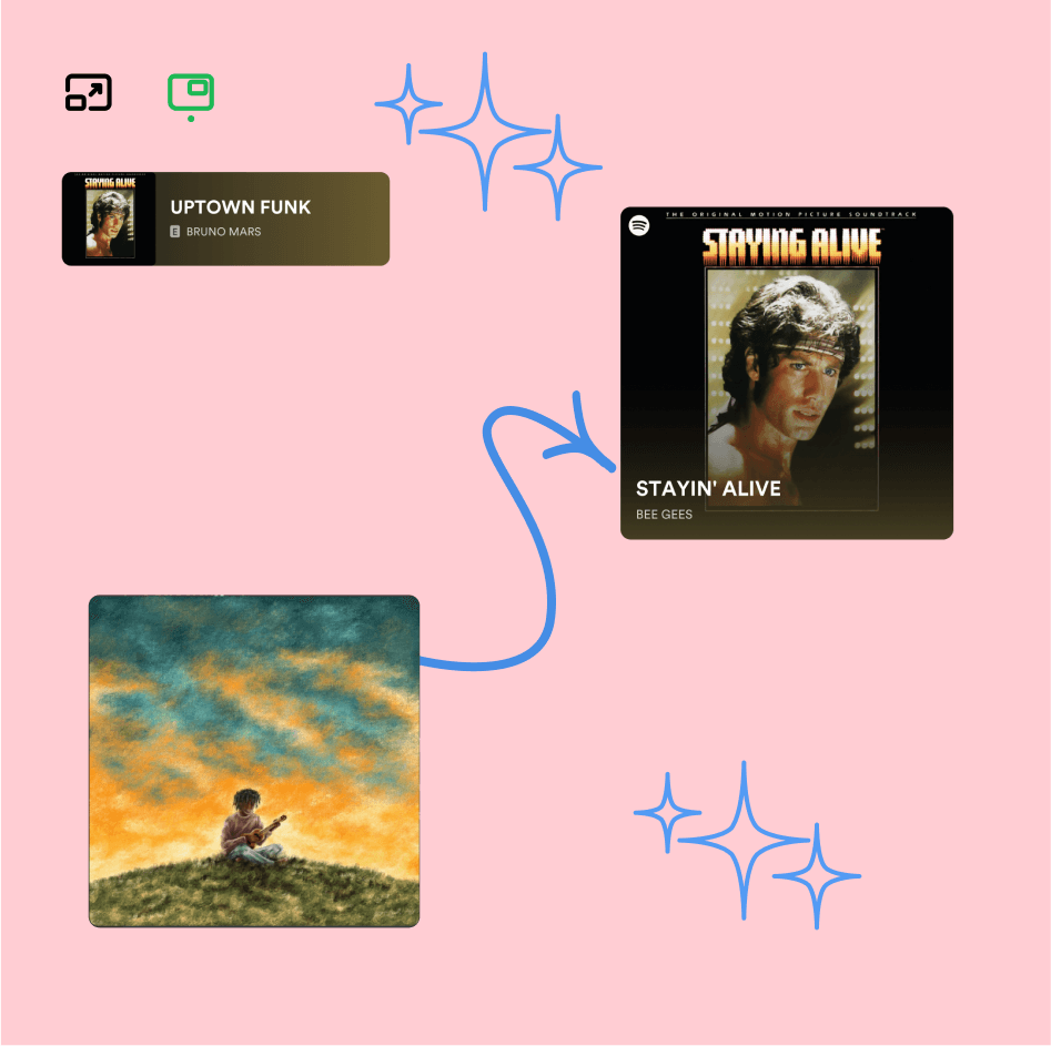
Ideation Project
New
Widgets:
For Window
Widget for Mobile &
An ‘always-on-top’ widget for Spotify Windows player.
Ideation Project
New
Widgets:
For Android
Widget for Mobile &
An ‘always-on-top’ widget for Spotify Windows player.
Problem solving project
Liked list
Users are unaware of the simple and interactive way of adding a song to the queue.
First ever project
Spotify queue list
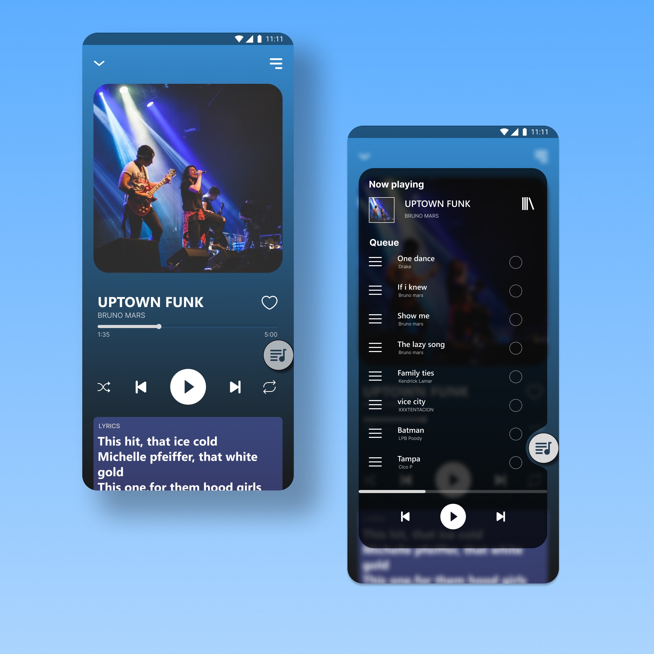
This is first ever project I did in UX/UI for design Practice, and came up with little personal solution for an queue list.
Projects
View all Projects
